
How To Match Colors and Designs in Your Home
When it comes to designing your home it's important to realize that you are the captain who steers the ship. No matter what you're designing, all final decisions ultimately lie in your hands. No matter what company you're working with - no matter how experienced or professional - consultants and contractors are merely navigators who can show you how to get from point A to point B. It's no different when mixing and matching colors, shades, and tones. While every person has their own personal style and approach, it is a good idea to know what what designs and colors work together and which ones do not. So here's a general guide to help you along the way. Let our South Florida Painting experts at Big Green Men give you some tips!
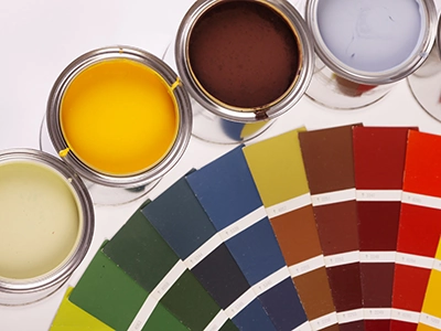
The Color Wheel
Before you proceed, it's a good idea to have a basic understanding of how colors work and what creates harmony among shades and tones. You can begin by looking at a simple color wheel which can be broken down into 3 major parts:Creating Color Harmony
The whole idea of putting together a room design is to blend a myriad of colors that all match and are instantly pleasing to the eye. This lends itself to numerous possibilities, but essentially it is possible to either go overboard or off the grid all together. While this does largely depend on your personal taste and style, the smart homeowner will also incorporate a degree of common sense and generally accepted taste into their decision making. So creating color harmony is essential. here are a few key concepts to remember.Colors and Moods
One thing to remember is that there is a direct correlation between color and how it affects your mood. Numerous studies have revealed that people feel certain way the moment they walk into any room. Although accessories and decor such as plants do play a part, ultimately, color is what creates the vibe. Colors behave in three basic ways: active, passive, and neutral. For instance, red raises energy and excitement. Yellow stimulates joy and happiness. Blue has a calming affect on an individual upon entry, and purple gives one the feeling of royalty and luxury when the step through the door.Using Technology
Today's advanced technology and software can help you in ways you never imagined. Many of today's home designers and consultants can capture your kitchen, bathroom, bedroom, etc. with a digital camera, load it into a software program and the digitally recreate. This allows you to remodel your room before you every launch the project. This way you can see if that shade of brown and orange will actually work together in reality, like the idea you had in your head. With professional consultation you'll end up saving time and money, and it will keep you from train-wrecking your next remodeling project.Give Your Miami Pressure Washing & Industrial Cleaning Specialist a Call Today!